Thursday 10 December 2020

SNOWMAN LOGISTICS- A great opportunity to invest in!

 Hello Readers!

STOCK NAME:     SNOWMAN LOGISTICS 

TICKER NAME:   SNOWMAN

CMP-                      RS. 61.25

TARGET -              RS. 85, 118

STOPLOSS-           RS. 55

Snowman Logistics grabbed eyeballs in 2015 at the time of its IPO. The price band was Rs. 44-47 and the stock listed at Rs. 75.  Back then, the market was not as interesting and volatile as it is today and this return meant serious and rare money for investors. 

Today the stock is trading lower than its listing price. Over the past 5 years, the stock has been correcting gradually, however, that does not undermine the importance of logistics in a country like India. 

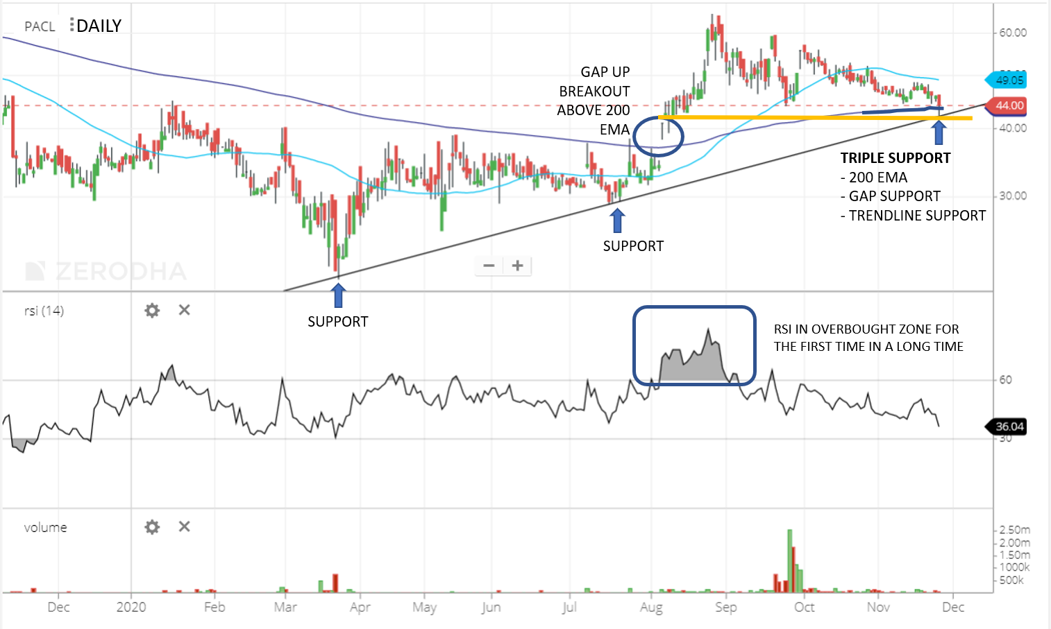
A look at the monthly chart shows strong movements. The two signs of strength are:

1) Volume is higher- Indicating accumulation which is supportive for a strong upside
2) The RSI has moved into the overbought zone, which is above 60, indicating strong bullish momentum
3) Most importantly, the price has forged a higher-high on the chart (breakout) and is continuing to move in the upward direction


Let's look at the daily chart and determine if there is similar positivity:

1) There is a flag pattern on the daily chart with exponentially high volume as highlighted below in daily chart
2) RSI is continuously in the overbought zone which is a sign of momentum refusing to give up on Snowman  
3) The volume observed on 10th Dec. 2020 was very high even though the price did not budge noticably. I am expecting a strong upside move from here onwards.


It is not every day that we come across such neat textbook patterns. These are easy to spot, read, and execute. 

I hope this analysis helps you make sound investment decisions and learn while you do it. Please feel free to write to me for more explanation at kchamaria1993@gmail.com. You can also join my whatsapp group by following this link

To conclude, in the near term, I am anticipating a target of Rs. 85 and long term-  target of Rs. 118 with a stoploss of Rs. 55 from the current market price of Rs. 61.25. 

Happy Investing!

Thank you for reading, please leave your comments below if you enjoyed it!
 
Choose the platform you use the most and follow the link to follow Let's get Technical on the go!

Regards, 
Kavita Chamaria 


Friday 27 November 2020

Punjab Alkalies and Chemicals Ltd (PACL)- A Tale of Triple Support and Promising Signals

Hello Readers!

Punjab Alkalies and Chemicals Ltd. (PACL) fell almost 75% from its lifetime high of 85 and took support at 21.50. 

Since that bottom, PACL has ensured in an uptrend

RSI is in the bullish range oscillating in the 40-80 range from the previous bearish range of 20-60


PACL is currently on the support trendline it has respected on the past three occasions as circled in green 


A closed look at the daily chart below indicates that the support is very strong due to 3 reasons:

1) The presence of the 200 EMA (exponential moving average) is a strong technical indicator and has often proven to be a reliable one.

2) During the last leg up PACL broke out above the 200EMA with a gap up (highlighted by the circle), and is now on the same level, making this a psychologically important level and therefore a potential price support

3) The up-trendline as discussed above and highlighted by an arrow in the chart below is, of course, evident support. 


These pieces of evidence from the moving average, trendline, gap ups, and most importantly, from RSI, when grouped together, are enough to hope that the stock will reverse and trend higher. 


To provide for whiplash, I would lookout for a closing lower than Rs. 38 in the stock to reconsider the analysis, but until then, I will continue to be hopeful of the stock scaling up to Rs. 85 again. That is a potential upside of 88% from the current stock price of Rs. 45!


Thank you for reading, please leave your comments below if you enjoyed it. 

Choose the platform you use the most and follow the link to follow Let's get Technical on the go!

Blog: https://goo.gl/qd2jDG
Twitter: http://bit.ly/2QLoQm6
Facebook: http://bit.ly/2RQErlN
LinkedIn: https://bit.ly/2QR4ZBY
Instagram: https://goo.gl/ftYub6


Regards,
Kavita Chamaria
kchamaria1993@gmail.com


Saturday 21 November 2020

INDOCO REMEDIES- A long term opportunity spotted

 Hello Readers!

Please read the analysis I recently did on INDOCO REMEDIES for a friend. 

I usually do not cover Indoco Remedies but happy to analyse the stock upon request. If you would like stocks to be analysed please write to me at kchamaris1993@gmail.com or comment below!

INDOCO

Current Market Price- 257

Target 412 (+60%)

Stoploss 235 (-8.5%) 

The short term direction for Indoco looks very unclear as the stock is range-bound, and neither the price nor the momentum indicator is giving clear signals about its short term potential action. However, the movement is encapsulated between two trendlines with resistance at 315 and support in the range of 235-240. A breakout beyond either level with help in determining the direction.

The stock is easier to analyse for the long term- It has confirmed a bullish trend in January 2020 as shown on he chart but experienced the covid shock in march 2020. Ignoring trendline breach (as it was sentiment-driven), the stock has clearly resumed the uptrend. The last few months have witnessed higher volumes (blue circle) which means there is accumulation going on in the stock and is positive. As per the weekly chart, I am inclined to believe that a target of 412 is very much possible. At the current price of 257, this means a +60% target with stop loss at 235(-8%). The risk-reward appears promising if one is willing to play the stock for the long term.

I would love to hear your thoughts about this INDOCO. 

Thanks for reading!

Kavita Chamaria 

kchamaria1993@gmail.com


Thursday 19 November 2020

Crude Oil Update & US leading Renewal Companies

The article below was written for the 7th edition of the Energy Insights Newsletter- EnSights. The newsletter is circulated to select employees in Royal Dutch Shell- where I work as an Economic Advisor- in order to share my technically driven insights on the global energy industry. 

Hello Readers,

The energy paradigm continues to change every single day. Keeping an eye on the energy sources of the past, present and future is ever more important to timely spot opportunities and make sound investment decisions. In this article, we start with a look at crude oil - to gauge where it might be headed, followed by the technical analysis of a few clean energy companies. 

Crude Oil update


In the previous article, we discussed the grim future of crude oil while it was surfing at the level $42- $43.80 in August. Post that article, crude glided lower and found support $36 in September. While this 18% decline was swift (over 5 trading days), crude has since then been oscillating in a broadening triangle pattern as shown on the chart. The bound lines are noticeably diverging from each other with $42 posing a clear resistance to price. A look at the momentum indicator, RSI, indicates that weakness in crude oil price will continue as RSI remains shy of 60 (the bearish resistance zone on RSI). From this point onwards, we expect a decline in crude oil prices and approach support at $34.50. The current market price of crude is $41.31, price resistance is at $42 and the support is at $34.50.   


Next, we cover the analysis of the clean energy companies covered in the article above.

Nextera Energy Inc. – 


This stock recently split 1 to 4 effective from 26th October’ 2020, helping improve liquidity. Even though clean energy continues to hold the centre stage in business discussions, the stock price of NEE is not showing promising signals in the near term. Please refer to the above chart- The stock continues to oscillate in the ascending channel for now, but weakness in price momentum is evident by its failure in touching the resistance trendline (red) after rallies and breaching the support trend line (green) on one occasion during a correction (circled). The Relative Strength Index (RSI) is showing negative divergence - meaning the RSI is moving lower whereas the stock price is moving higher (yellow lines). If the stock price ends below the level of $74 on any day, that would substantiate this observation of suspected weakness to ensue in the prices and indicate temporary correction.

Brookfield Property Partners LP


The clean energy theme has buoyed stock prices of sector leaders in the renewable energy space and BPP is no exception. Like NEE, it has been moving upward - bounded by a channel- and posted 60% return YTD amidst COVID-19 pandemic. As we can see in the adjoining chart, there are two indications of price weakness in the near term. 1- the stock recently touched the resistance trendline (red arrow); 2- the negative divergence between price and RSI. The slowing momentum over the past few days is strong evidence to believe that prices might reverse for a correction soon to meet the support trendline at $12. The current market price is $16. Price is yet to confirm this theory and a move below $14.9 is the confirmation we seek.

First Solar Inc. 


The largest clean energy player in the US, FSI posted YTD returns of 40% till date, This is an under-delivery compared to the potential this stock holds. Referring to the above chart, the good news is that the stock price has given a breakout from a 7-year-old trendline on 12th Oct (blue circle). Currently a pullback, from the resistance trendline is unfolding towards the two support trendlines waiting at $69.45, after which the stock is expected to continue its journey upwards of $100.

SolarEdge Technologies Inc.


SEDG is a stock with strong trending tendencies. The YTD return itself is 118%, but if you looked closely it has rallied 350% from the low of March ’20 of $70 to the recent high of $315 in just 7 months. Looking at the daily chart we can see the stock has been correcting recently and is headed for the support level at $208 (35% correction from $315). Coincidently, the level of $208 happens to be a cluster of supports re-enforcing its strength. If $208 is breached, then the next support would be $180. However, the charts do not feel like they might need the support as the momentum indicator is signaling strength and resilience in the stock price which means that an upside rally may soon be witnessed after a little more correction.

Enphase Energy Inc. 


ENPH has posted a perpendicular upside move since June 2017, clocking in a mindboggling 15,788% gain for investors who got in at the right time. Having noted that, the rally is far from over as of now. A quick look at the recent price data on the daily chart reveals that this stock has a long way to go before it truly rests. However, the momentum indicator – RSI, suggests that it may be time for a minor correction in the stock price indicated by negative divergence. A short-term correction is expected from the current price level of $120 to $96. On the face of it, that is a 25% correction, which may be a lot for other stocks, but is a mere nail trim for Enphase Energy.

After going through the few stocks covered above, the growth trajectory of the clean energy sector stands out vividly. The sector might experience a mild correction in the near term, but the long-term prospects continue to be attractive and promising. 

Thanks for reading! Please leave a comment below !

Choose the platform you use the most and follow the link to follow Let's get Technical on the go!


-     Kavita Chamaria     
      Email: kchamaria1993@gmail.com

Tuesday 6 October 2020

BHEL- A great opportunity

UPDATE 1- 13TH OCTOBER 2020

Follow up on BHEL:

The stock moved below stated support- which is slightly frustrating, and also raises the question if we are dealing with a support zone instead of a level? this calls for a fresh look on the stock (red highlights).

A positive development on the hourly charts- RSI positive divergence. Price is forming lower-lows (downward sloping line on price, yellow highlight) but RSI is making higher-lows (upward sloping line on RSI, yellow highlight).


BHEL 2 HOUR CHART

______________________________________________________________________________

PUBLISHED ON: 6th OCTOBER 2020

Hello Readers!

BHEL’s hourly chart is indicating strength. It started correcting from 42.5- a strong resistance zone , and has fallen nearly 31% in the last 1.5 months.         

The consolidation (sideways movement) in the price observed over the last few days is backed by a display of strength in the momentum indicator- RSI. 

The relative strength indicator (RSI) is telling us 'Look ! relative to the past few days price is doing better' by simply by keeping its nose above 30 as highlighted in yellow. Every time RSI was below 30, BHEL's price kept slipping lower and lower as highlighted in red. This indicates a stop to the price slide. 

BHEL is offering a great risk-reward-ratio at this level. 

Current price -     29.30

Stoploss -              28.90  (-1.5%) 

Targets -               34.8 (19%) , 42 (40%)


Thanks for reading. 

Choose the platform you use the most and follow the link to follow Let's get Technical on the go!


Telegram: https://t.me/letsgettechnical

You can also join the following groups for instant update
 
Regards, 
Kavita 


Tuesday 15 September 2020

Renewables- An addition to the energy paradigm

Sharing below an article I wrote for the 6th edition of the Energy Insights Newsletter- EnSights. The newsletter is circulated to other employees within my company- Royal Dutch Shell to share insights and understanding of the industry at large. 

Hope you enjoy the read!   

Hello Readers!

This time last year, I researched the US meat industry for a start-up selling veganism. In the course of my research, I came across some interesting trends in the American meat consumption pattern. Several articles talked about the growth of the poultry industry in a market largely dominated by red meat. When I investigated official US numbers, I learned that over the last 30 years, the American platter had doubled- who would have thought the growth of the poultry industry would not replace the legacy red meat despite exponential growth in poultry consumption, instead, would get a place of its own on the now enlarged appetite of the American population.

Let’s replace the appetite for food with an appetite for energy. As the appetite for energy continues to increase exponentially, the introduction of renewable energy does not pose a threat to the existing oil and gas industry, instead, they both jointly supplement the energy paradigm, just like poultry and red meat did supplement the US meat industry today.

The advent of renewable energy is like the introduction of a younger sibling into a family. The new member grows to have his own identity, own roles, and responsibility, its introduction temporarily disrupts the status quo initially, but soon there are adjustments and reallocation of resources and eventually, both the younger and the elder siblings contribute to the fulfillment of the family’s needs on their individual levels. The introduction of the younger one (renewables) does not mean the elder one (oil and gas) is going to be entirely replaced/ substituted, however, the resources (investments) the elder one solely enjoyed – now get divided and the parent’s (producers and consumers) attention gets diluted.

Renewables as a source of energy are no more a ‘threat’ to the oil and gas industry than its own carbon footprint. Oil and gas are also no longer enough to fulfill the ever-growing energy demand globally. The introduction of the renewables to energy industry is like the introduction of poultry to the US meat industry- simply an add-on to the existing menu.

While renewable energy continues to become more and more cost-effective, and thoughts of scalability keep the pioneers awake at night, retail and institutional investors across the globe dig deep into their pockets to take up stake in renewable space. A look at the Nasdaq Clean Edge Green Energy Index (CELS) reflects this optimism. The index constitutes the following:

1. Advanced Materials (silicon, lithium, bio-based, and/or other materials and processes that enable clean-energy and low-carbon technologies)

2. Energy Intelligence (conservation, efficiency, smart meters, energy management systems, LEDs, smart grid, superconductors, power controls, etc.);

3. Energy Storage & Conversion (advanced batteries, power conversion, electric vehicles, hybrid drivetrains, hydrogen, fuel cells for stationary, portable, and transportation applications, etc.); and

4. Renewable Electricity Generation (solar, wind, geothermal, water power, etc.)

The weekly log chart of the

NASDAQ® Clean Edge® Energy Index (CELS) recites a tale of investor optimism towards clean energy. Between Mar to Aug ‘20, the index has posted an incredible 175% return. Since the financial crisis in 2007-08, the index had been resisting the level of 280. In 2019, nearly 12 years after the financial crisis, the index not only overcame the resistance but also rallied at the back of real-world problems growing out of climate change and a globally broadened consciousness demanding clean energy. With the advent of COVID-19, like every other index in the world, CELS also witnessed a shock that took it back to the sub 280 levels, but it bounced back with vigor and has been unstoppable since then. This rally is expected to continue and post exponential returns over the next decade in accordance with the principles of the Elliott Wave Theory.


Renewables and fossil fuels are not the two sides of the same coin, they are more like a currency pair, wherein they will work together closely to maintain the global energy parity.

Thanks for reading :)

Choose the platform you use the most and follow the link to follow Let's get Technical on the go!


You can also join the following groups for an instant update
 

Regards, 
Kavita 


Monday 14 September 2020

SEBI's new norm & its impact expected on Nifty 50

Hello Readers,

Nifty has posted a bearish engulfing. This coincides with the big announcement by SEBI to establish minimum investment requirements in each market cap category- large-cap, mid-cap and small-cap. This decision, while disruptive of the natural market forces of demand and supply is a gift for the small-cap investors. You might have noticed several small-cap indices have given a marvellous run-up today, refer to the snapshot below-
This is however not good for Nifty50 as it comprises of the largest 50 stocks in the market. 
Now, if you have Rs.10000 (100%), in the following denominations:

Rs. 2500 in a promise coupon from your Mother that she will pay you this money on so-and-so date (debt) (25%)
Rs. 6000 in 6 notes of 1000 denomination notes (large caps) (60%)
Rs. 1000 in 10 notes of Rs. 100 (mid cap) (10%)
Rs. 500 in 100 coins of Rs.5 (5%)

But SEBI is now asking you to hold this same Rs. 10000 in such a way that you have at least 25% each of large-cap, mid-cap and small-cap. 

So now, you will have to ensure that you have 
1) At least Rs. 2500 in Rs. 5 denominations, that is 5 times of Rs. 500. That's a minimum 5x rally in the small caps

2) At least Rs. 2500 in Rs. 100 denominations, up from Rs. 1000, that is a 1.5x rally. 

So this means you have 50% already allocated to mid and small caps. Now initially you were holding 60% portfolio in large caps. 60+50=110- not a realistic scenario. So you will have to unload your Large caps to accommodate the mid and small caps.  

This, when applied to the stock market, will mean a boo-boo for Nifty 50. The large-cap index is already displaying three undeniable signs of weakness as elaborated in the analysis below.


This move by SEBI will prove to be a big promoter for the Indian economy in general and I believe is very much in line with the Central Government's mandate of promoting small businesses as observed in the budget 2020. 

Please leave your thoughts in the comment section below. This will help me improve my content. 

Thanks for reading :)

Choose the platform you use the most and follow the link to follow Let's get Technical on the go!


You can also join the following groups for an instant update
 

Regards, 
Kavita 


ADANIPORTS

Hello Readers!

Here's the quick analysis on Adani Port upon request from one of you-


ADANIPORT is currently trading at 342.50 after a slight correction of 12% over the last two weeks. The resistance marked on the chart below is at 363- an important level. In the past it has acted as a support level multiple times- two such instances have been highlighted on the chart below.  

Click to enlarge        Adani Ports Daily Chart as on 14/9/20


Turning our attention to support on this stock, it is not a level but a zone- 309 to 319.

RSI on the daily chart turned up from 30 ( marked by arrow) while price took support at the above-mentioned support zone. This is a good indication of strong underlying momentum.

To wrap it, adaniport looks positive. However, I would wait for sometime to take a long position in pursuit of a more favourable risk-reward-ratio. 330 seems like a good probable point of entry, however, the prevalent market circumstances at that point of time will have to be reconsidered.

A breach below 309 would be your cue to exit as it appears like a cliff fall below this support.

Regards,

Kavita Chamaria 

Tuesday 8 September 2020

BITCOIN - Technical Analysis

 Hello Readers,

Bitcoin analysis works with RSI range 40 to 70 on the daily chart, unlike the 30-60 level observed on stocks and indices.  In the chart below, we have analysed the daily chart to observe the price behavior when RSI successfully reverses from 40. Turns out, and also highlights on the chart, every time RSI on the Bitcoin Index has taken a support at 40, the price has rallied strongly. This establishes the fact that historically RSI has worked as a wonderfully reliable indicator in forecasting bitcoin rallies. 


Figure 1: Daily chart: Bitcoin (USD), captured on 8-Sept-2020

A closer look at the daily chart of Bitcoin shows that it recently broke below the support level of 10900. Few concerning observations are:
1) The breakdown happened against very high volumes (blue rectangle on the chart)
2) The breakdown took RSI below the level of 40 (blue circle)

The immediate support now is the red line indicating the 200 EMA level of 9000 which is historically and psychologically very important. 


Figure 2: Daily chart: Bitcoin (USD), captured on 8-Sept-2020

Re-adjusting our lense to look at the wider picture again, in order to determine what happens when RSI breaches below 40, we get the below picture (figure 3).
Every time RSI has gone below 40, price on Bitcoin Index has corrected more than 20%. That being said, not all corrections were a result of RSI breaching level 40 but all RSI breaches resulted in a heavy correction. 
The most recent data shows that RSI has already breached the level fo 40. This is a good indication of the correction which is bound to follow. The probable support on the chart is at 25% downside from the current level. The current level is $10,126 and strong support is at roughly $7500. 
It is best to look out for the level of 8900-9000, given its importance and in the event of a breach, brace for further slide.  


Figure 3: Daily chart: Bitcoin (USD), captured on 8-Sept-2020


Follow this link for a downloadable PDF version of the above analysis. 

Please don't forget to follow this blog and leave your comments below! 

Thank you for reading!

Choose the platform you use the most and follow the link to follow Let's get Technical on the go!

    Twitterhttp://bit.ly/2QLoQm6
    Facebookhttp://bit.ly/2RQErlN
    LinkedIn: https://bit.ly/2QR4ZBY
    Instagramhttps://goo.gl/ftYub6

You can also join the following groups for instant update
 
    Telegram group https://t.me/letsgettechnical 


Regards,

Kavita Chamaria

kchamaria1993@gmail.com


Monday 17 August 2020

SBIN: Technical Analysis of an Upside Opportunity

Hi All,

Sharing a very detailed analysis of SBIN. I have covered the though process from the first look of the chart to the drawing the final conclusion of a probable run-up with 5 explanatory infographics. 


Follow this link for a downloadable PDF version of the analysis. 

Your comments below are welcome. 

Thanks for reading!

Choose the platform you use the most and follow the link to follow Let's get Technical on the go!


Regards,

Kavita Chamaria

kchamaria1993@gmail.com


Wednesday 12 August 2020

CRUDE OIL: The damp days to return, another price decline on the charts

 Hello Reader!

While the world grapples with the aftermath of COVID-19, the business and finance world is struggling to adjust to the new realities as well. With lowered top-line across most of the businesses, the emergence of new sectors, higher digitalization stands to threaten several status quo previously prevalent. over the next year, we will witness many businesses go down the same path producers of chariot whips and boot heels for men did. Evolution is the key to survival for businesses. 

But what about the cost? The lowered crude oil price has send many businesses into a frenzy. Government and businesses have openly filled in their crude oil reservoirs with what they perceived as never to return cheap prices. However, what if I told you that the lower prices were returning soon? 

A simple technical analysis of the crude oil charts across different time frames has a well-knit story of the downtrend which has been unfolding on the charts of crude oil since the crash in 2007.

Crude Oil stands at $41.8 per barrel. This is historically a very important price zone. On several different occasions in the past, crude oil has taken support at this level as highlighted in the chart below. Now, with the world being a very different place, $41.8 is posing as a strong resistance. This fungible nature of price levels is quite commonly observed across stock indices, individual stocks, currencies, and commodities. 

Crude Oil price Analysis

                                    Crude Oil: Monthly Chart- Period shown : 2009 to 2020


Lower-highs, lower-lows have been observed in crude oil post the 2007 crash. The Primary trend has been down with intermittent rallies. Since April 2020, one such minor trend upside rally has been witnessed.


A quick glance at RSI shows how a penetration below the level of 30 has meant more bad news for crude oil. Back in Dec 2014 when RSI broke below the level of 30, prices could only temporarily recover after that. Soon in Jan 2016, crude oil forged a new price low after falling 50% from its recent high of $61 to $27 per barrel.

History can be seen repeating itself. Today, crude oil price stands at the strong resistance zone of $42 PB, with lost momentum and at the edge of a cliff. It is only a matter of time when crude oil prices will fall again and forge a new below $20.  We are discussing the possibility of a 50% price slide from the current levels as indicated by RSI. 


                                    Crude Oil: Weekly Chart- Period shown: 2009 to 2020


After having looked at the monthly and weekly charts of Crude Oil, the story recited by the Daily chart is no different. It reverberates the eminent message of downfall by means of the Negative Divergence between price and RSI. Negative divergence is an indication of lost price momentum. It is especially potent when it occurs close to an important price resistance (like $42 in this case) after a prolonged rally.

All across the time horizons- monthly, weekly, and daily, the tale of weakening crude oil prices can be heard loud and clear. It is best to be cautious and brace ourselves for what is to follow. The pain of hammered crude oil price is going to resume.


                                    Crude Oil: Daily Chart- Period shown: March 2020 to Aug 2020. 


 That's all on crude oil. 

Thanks for reading!

Choose the platform you use the most and follow the link to follow Let's get Technical on the go!


Regards,

Kavita Chamaria

kchamaria1993@gmail.com


Balrampurchini- A successful analysis of a cyclical stock

 Here is the original post on Balrampur Chini (sugar stock) posted before the big sweet rally:

(click here >>>) Thursday, 23 August 2018 : Balrampur Chini: Bottom fishing (A study of range shift in RSI)


Balrampurchini Daily Chart captured on 24.08.2018
Regards,
Kavita 

Saturday 14 March 2020

Crude Oil Price Crash for Dummies

Hello Readers,


The recent crude oil price crash is second only to spread of the COVID-19 globally in panic terms. The base for almost all fuels, as we know, has lost nearly 50% from the high of $65 per barrel in last 3 months, of which, nearly 32% has been recorded in the past 5 trading days alone. Crude oil prices are falling like a rock under the influence of gravity.

Two questions come to my mind here-

1) Why?
2) Until where?

To answer the first question first, we know crude oil prices are determined by two primary forces- demand and supply.

On the demand front, China has ceased to be the primary manufacturer, favourite cuisine or  emerging world economy and garnered a new reputation as the epicentre of a pandemic. In the heart of all things that China was best known for, it was also the biggest consumer of crude oil, but come 2020 and the advent of the COVID-19, it has come to a standstill with visibly lower demands for crude as organisations have stop manufacturing operations and people have stopped travelling.

The impact of this is much larger than ever priced in any scenario analysis. The pandemic has touched nearly 115 countries. The globally cascading effect of the disease- operational shutdowns, travel bans- is bound to have a palpable negative impact on demand for crude oil.

Now, the logical solution in a situation of demand set back would be to cut production. However, what is adding oil to the fire here is the current supply flux. OPEC collapsing after the failure of negotiations between Saudi Arabia and Russia to cut production in the face of an already suffering demand paradigm came as a shock for the global trading community as witnessed via the price crash.

Moving on to the next question ’until when’.

The simple answer is- no one knows. However, what we can identify using techniques of technical analysis is a probable support level for WTI Crude Oil. But before that, let’s look at the daily and monthly price charts below.


On the daily price chart, the breach of an important ‘triple bottom’ support level of $42.20 last week, combined with a ‘runaway gap’ is a knell bell and a text book set up for further price decline. The slight bounce in price witnessed after the piercing fall is popularly known as a ‘dead cat bounce’. In simpler language, it means that the bounce has no credibility, it is only an acknowledgement of the knee jerk reaction witnessed in price.


However, if we take into consideration the monthly chart above, the current price crash does not look quite as bad as those witnessed in the past. In both the big fall we have witnessed so far (2008,2014), price has forged a lower high and a lower low at every turning point, thereby confirming a primary downtrend. By definition, the term ‘bear market’ is used when a script/index/future contract has lost more than 20%. However, we are playing with much bigger numbers and calling it a mere bear trend does not do justice to the scenario we are looking at. What is worth noting is that, during both the past price crashes, support came in at approximately 70% price decline from the last peak.

To conclude, having brought to attention similar instances of price crash that have happened till date and taking into consideration that the threat of this pandemic is as real as the financial crisis of 2008 and in fact more global in nature, the pain should at least be at par with the past incident, if not worse. This brings us to the end with a lingering question that would crude prices be driven to a range of $18 to $21PB?  The potential support range incidentally is also the only price support visible on the monthly chart which is below the triple bottom support that was breached earlier this week.

Thank you, for reading!

Regards,
Kavita Chamaria